
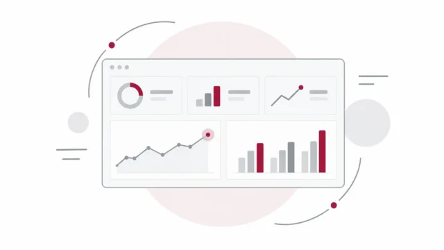
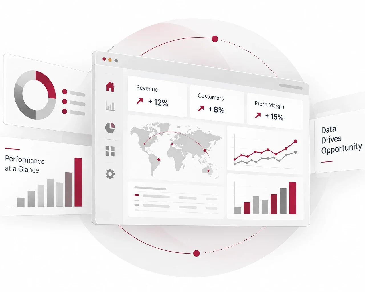
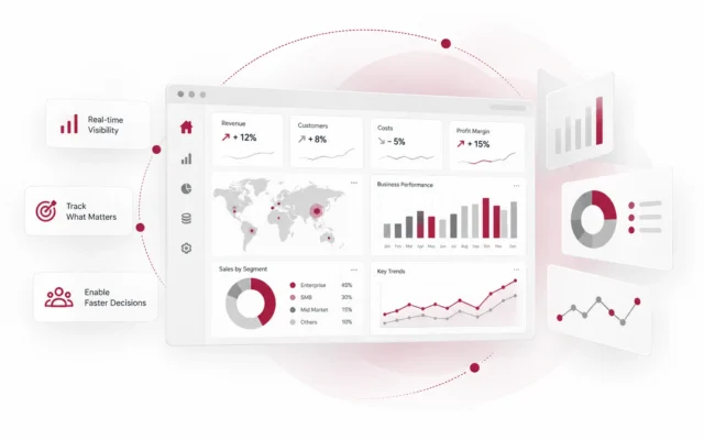
Give decision-makers a clear view of the measures that matter most. We design dashboards that bring KPIs, business performance, trends and exceptions into one intuitive view—helping leaders understand where the business stands and where attention is required.

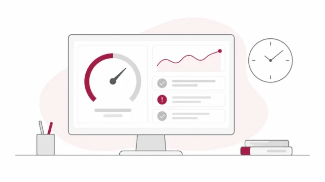
Move beyond static reports with dashboards that encourage exploration. We build interactive visualisations that allow users to analyse information across business units, locations, customers, products, time periods and other dimensions while keeping the experience simple and easy to use.


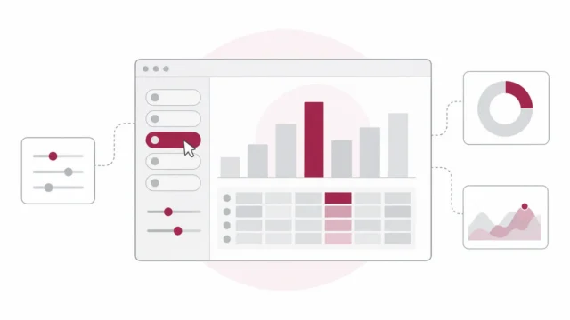
Turn operational data into practical visibility for day-to-day management. Visualise productivity, utilisation, capacity, service delivery, quality and operational KPIs in a structured format that helps teams quickly identify bottlenecks, exceptions and improvement opportunities.
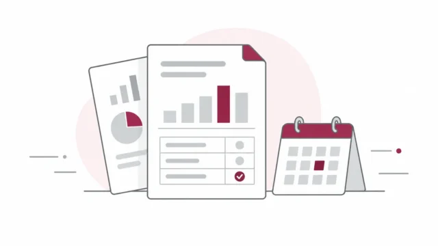
Replace fragmented spreadsheets and repetitive reports with clearer management information. We organise multiple data sources into structured reporting views that show performance, variance and important business developments, helping management focus on what requires action rather than interpreting pages of data.
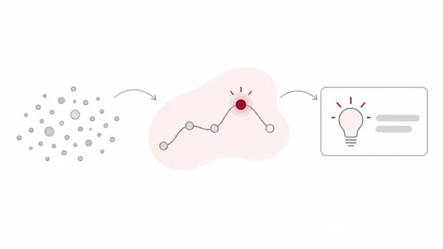
Present information in a way that explains not only what happened, but why it matters. We combine visual hierarchy, analytical context and business storytelling to communicate trends, relationships and insights clearly—making complex analysis easier for stakeholders to understand and use.


©2026 All rights reserved. Read our Privacy Policy & Terms & Conditions for more.