Make Data Easier to Understand. Decisions Easier to Make.

Raw data has limited value until people can understand and act on it. Intris transforms complex information into clear dashboards, visual reports and interactive analytical views that help leadership and operational teams monitor performance, identify trends and make informed decisions faster.
https://www.intris.in/wp-content/uploads/2026/09/Intris-Data-analytics-Data-Visualisation-640x360.webp

Executive Dashboards

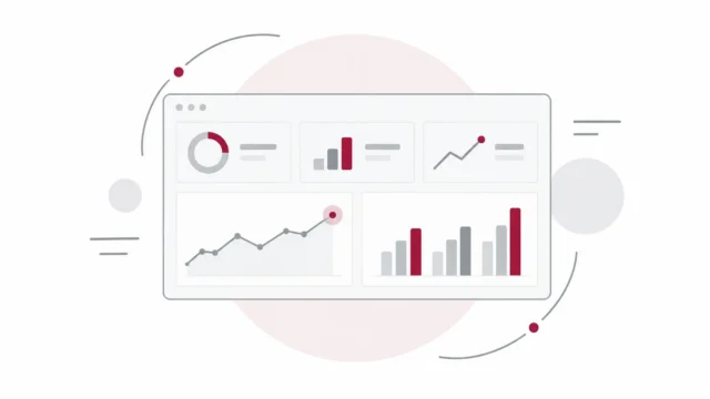
Give decision-makers a clear view of the measures that matter most. We design dashboards that bring KPIs, business performance, trends and exceptions into one intuitive view—helping leaders understand where the business stands and where attention is required.

https://www.intris.in/wp-content/uploads/2021/06/img-floater-1.png
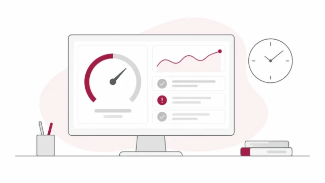
Real-time performance monitoring dashboard with trends, metrics and alerts

Interactive BI Visualisation

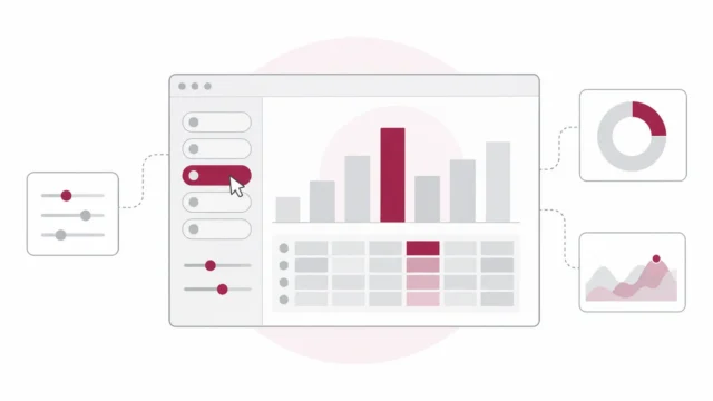
Move beyond static reports with dashboards that encourage exploration. We build interactive visualisations that allow users to analyse information across business units, locations, customers, products, time periods and other dimensions while keeping the experience simple and easy to use.


https://www.intris.in/wp-content/uploads/2021/06/img-floater-3.png
https://www.intris.in/wp-content/uploads/2021/06/img-floater-2.png
Interactive data visualization dashboard with filters, charts and performance metrics

Operational Performance

Turn operational data into practical visibility for day-to-day management. Visualise productivity, utilisation, capacity, service delivery, quality and operational KPIs in a structured format that helps teams quickly identify bottlenecks, exceptions and improvement opportunities.

Business reporting and scheduled performance visualization

Management Reporting

Replace fragmented spreadsheets and repetitive reports with clearer management information. We organise multiple data sources into structured reporting views that show performance, variance and important business developments, helping management focus on what requires action rather than interpreting pages of data.

Data-to-insight visualization supporting faster business decisions

Data Storytelling & Insights

Present information in a way that explains not only what happened, but why it matters. We combine visual hierarchy, analytical context and business storytelling to communicate trends, relationships and insights clearly—making complex analysis easier for stakeholders to understand and use.

Turning Data Into Decisions — Our Visualisation Approach

From understanding your reporting needs to delivering decision-ready dashboards, Intris follows a structured approach that turns complex data into clear, meaningful and actionable visual insights.

Business Objective

To work on a practical solution, We understand your business objectives, users, reporting challenges and key decisions to identify the KPIs and insights that matter most.

Data Sources

We review available data sources, assess data quality and define the reporting structure, visual hierarchy and dashboard requirements around your business priorities.

Dashboard Design

We transform data into intuitive dashboards, charts and analytical views designed to make trends, relationships, exceptions and performance easier to understand.

Insight Validation

We validate calculations, KPIs and visual outputs with stakeholders, refining the dashboards for accuracy, usability and clear interpretation across different user groups.

Decision & Improvement

We deploy the visualisation solution, support user adoption and continuously enhance dashboards as business priorities, data sources and reporting requirements evolve.

Clearer Data. Better Visibility. Smarter Decisions.

We transform complex information into intuitive dashboards and visual insights that help your teams understand performance and act with greater confidence.
  • Dashboards aligned with your business goals
  • Clear and meaningful KPI visualisation
  • Consistent reporting across teams and functions
  • Easy-to-understand visual storytelling
  • Continuous optimisation as business needs evolve
https://www.intris.in/wp-content/uploads/2021/06/img-floater-2.png
https://www.intris.in/wp-content/uploads/2021/06/img-floater-3.png
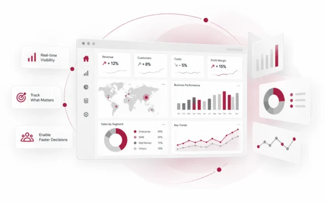
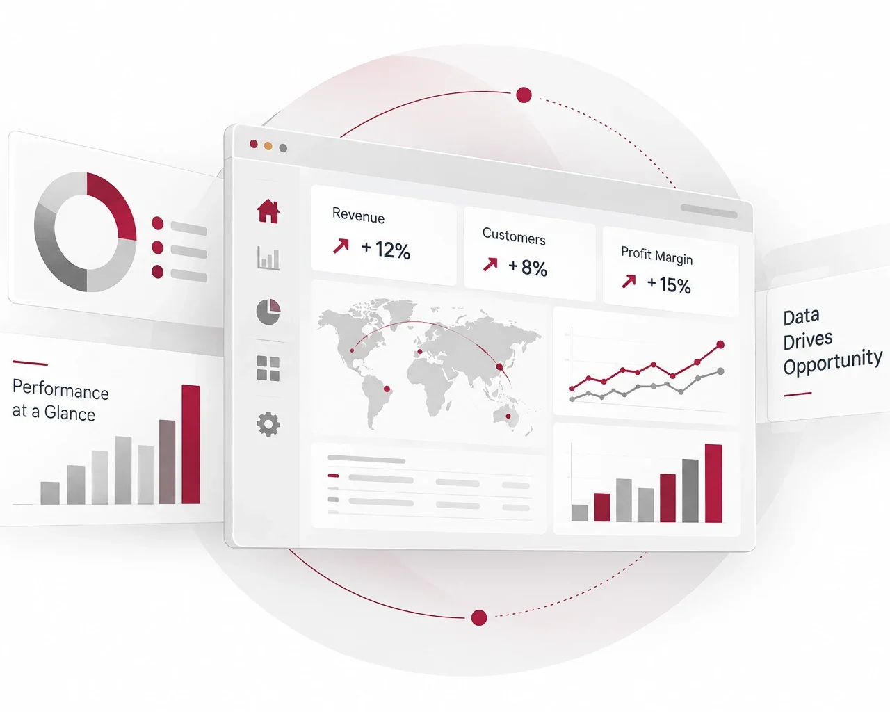
Executive performance dashboard with geographic and business KPI insights
bt_bb_section_top_section_coverage_image
bt_bb_section_bottom_section_coverage_image
https://www.intris.in/wp-content/uploads/2021/06/img-floater-3.png
https://www.intris.in/wp-content/uploads/2021/06/img-floater-8.png
https://www.intris.in/wp-content/uploads/2021/06/img-floater-1.png
Real-time business metrics dashboard for performance tracking and decision support

Turning Complex Data Into Business Clarity

Data becomes valuable when people can understand it quickly and act on it confidently. Intris transforms complex, fragmented information into intuitive dashboards and visual reporting solutions that reveal performance, trends, exceptions and opportunities—helping leadership and operational teams make better-informed decisions.
Business Clarity — Visuals aligned with your decision priorities90%
Insight & Usability — Dashboards designed for faster understanding95%
Decision Support — Turning performance data into actionable direction90%
https://www.intris.in/wp-content/uploads/2021/06/img-dotted-separator-2.png

Reach out to Intris to get Practical & Sensible solutions.

+91-7845000033

https://www.intris.in/wp-content/uploads/2021/06/img-floater-8.png
Page top