Australian Disability and Community Care Provider
Client Profile
A multi-location Australian care provider delivered disability support, community participation, supported independent living, in-home care, and allied support services. Its operations covered several service regions and involved support workers, care coordinators, participants, families, external practitioners, and funding stakeholders.
As the organisation expanded, operational data became distributed across rostering systems, participant-management platforms, finance applications, incident registers, workforce records, and manually maintained spreadsheets.
Business Challenge
Senior management could see individual reports but lacked a unified view of care delivery. Operational teams spent considerable time reconciling data before management meetings, and different departments occasionally reported different figures for the same performance measure.
The provider required greater visibility into:
- Participant service delivery and utilisation
- Scheduled versus delivered support hours
- Service cancellations and missed appointments
- Workforce availability and continuity of care
- Participant goals and progress
- Incidents, complaints and safeguarding trends
- Funding utilisation and plan expiry
- Service quality across locations
- Revenue leakage caused by unrecorded or unclaimed services
The key requirement was not simply a reporting dashboard. The organisation needed a role-based visual management system that could connect participant outcomes, workforce performance, service quality, and financial sustainability.
Data Visualization Strategy
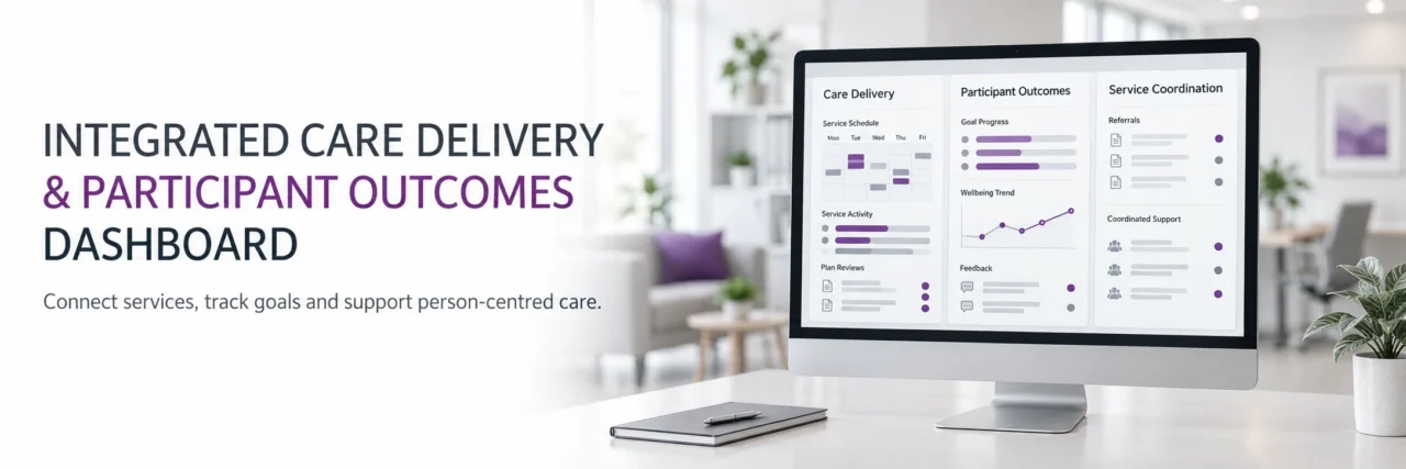
We designed an integrated visualization framework with separate executive, operational, participant, workforce, quality, and financial views.
Data was consolidated from:
- Participant and client-management systems
- Workforce scheduling and rostering platforms
- Timesheets and attendance records
- Incident and complaints registers
- Funding and service-agreement records
- Payroll and finance applications
- Participant feedback surveys
- Case notes and goal-progress records
A common data model was established to ensure that participants, locations, service types, funding categories, employees, and reporting periods were consistently defined.
Visualization Solution
Executive Performance Dashboard
The executive dashboard provided a consolidated view of:
- Active participants
- New admissions and service exits
- Total scheduled and delivered support hours
- Service utilisation percentage
- Participant retention
- Revenue by programme and region
- Workforce capacity
- Incident and complaint volumes
- Funding utilisation
- Participant satisfaction
- Goal-progress status
Trend indicators showed whether each measure was improving, stable, or deteriorating. Executives could move from organization-wide performance to programme, region, site, team, or participant-level analysis.
Service Delivery Dashboard
This dashboard compared scheduled, delivered, cancelled, and unfilled service hours.
Visualizations highlighted:
- Cancellation patterns by participant and service type
- Unfilled shifts by location and time
- Late starts and shortened visits
- Delivered hours awaiting approval
- Services delivered outside agreed schedules
- Recurring service interruptions
- Variance between planned and actual support
Calendar heat maps helped managers identify days and time periods with recurring service gaps.
Participant Outcomes Dashboard
A participant-centred dashboard was developed to show progress against individual goals without reducing care quality to a single numerical score.
The dashboard presented:
- Goals by life domain
- Goal status and progress over time
- Completed activities and interventions
- Participant engagement levels
- Review dates and overdue assessments
- Feedback from participants and families
- Changes in support requirements
- Barriers affecting goal achievement
Appropriate access controls restricted identifiable participant information to authorised users.
Funding and Plan Utilization Dashboard
The dashboard gave coordinators early visibility into participants whose funding was being underutilised, rapidly depleted, or approaching expiry.
It displayed:
- Approved funding
- Committed services
- Delivered services
- Claimed and unclaimed amounts
- Remaining funding
- Average monthly utilisation
- Forecast utilisation at plan end
- Plans approaching expiry
- Participants at risk of service interruption
Forecast visualizations helped coordinators assess whether current service patterns were likely to result in unused funding or premature exhaustion.
Quality, Incident and Safeguarding Dashboard
The quality dashboard consolidated incident, complaint, feedback, and corrective-action information.
It included:
- Incidents by type, severity, location, and programme
- Incident frequency relative to delivered care hours
- Recurring contributing factors
- Time taken to review and close incidents
- Complaints by source and category
- Open corrective actions
- Overdue investigations
- Repeat incidents involving similar conditions
- Positive feedback and service-recognition trends
Control charts distinguished normal variation from unusual increases requiring investigation.
Governance and Privacy Controls
The solution incorporated:
- Role-based dashboard access
- Restricted visibility of participant-level information
- Consistent KPI definitions
- Data-quality validation rules
- Audit trails for data updates
- Suppression of sensitive information in executive views
- Clear ownership for each performance measure
- Scheduled review of dashboard access permissions
Illustrative Outcomes
Following implementation, the provider achieved:
- A substantial reduction in manual report preparation
- Earlier identification of under utilised participant funding
- Improved visibility into unfilled and cancelled services
- Better tracking of participant goals and review dates
- Faster escalation of overdue incident investigations
- Improved alignment between care delivery and financial reporting
- Greater confidence in management-level performance information
Strategic Value
The visualization platform connected operational efficiency with participant outcomes. Management could identify not only where performance was changing, but also which participants, services, locations, or workforce conditions were contributing to that change.